The Redesigned Visa Developer Community is Live!

ricardo_visa
Community Scholar

We are excited to present our redesigned Community experience! This is the first phase of many changes coming to the Visa Developer Community.


Updated hero area


You get two different experiences depending on whether you log in or not.


hero2.PNG


hero3.PNG


Visitors will see a description of what the Community is all about, while logged in members will get a personalized welcome message with featured content we think you’d be interested in.  


New Menu & Better Navigation


Artboard 1menunav2.png


A more prominent primary nav, with dropdowns exposing the structure of the community are helpful, as are the big wayfinding tiles at the top of the page:

  • Journey tiles under “Popular Community Topics” expose clear navigation paths catered for different levels of your experience, from beginners to experienced developers.


PopularTopics.PNG


Updated Featured Topics on Homepage


FeaturedTopics.PNG


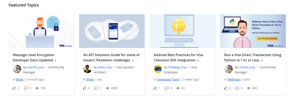
The latest and greatest Visa Dev content is now represented through a new featured posts section that will be updated weekly. We’ll be promoting developer articles and guides here, surfacing content to help save you time. We have updated this section to now give you more details so you have all the context you need before decided whether to explore more.  


New Forum Pages and Category Descriptions
 

Artboard 1forumpage.png


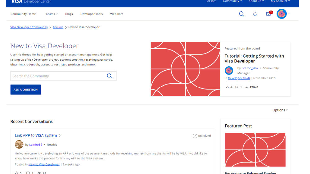
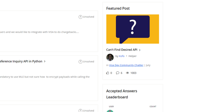
Each forum category has its own page with a clear description to help you figure out where you want to spend your time. We’ve also added Featured Posts for each category, highlighting helpful and insightful conversations happening among your very own posts. Keep an eye out, your question might get featured!
 

Artboard 1forumpage2.png


Updated My Profile Page


We’ve made it easier for you to connect with other developers through an entirely new profile page experience. Not only is easier to navigate but you can look at other member stats, showcase your own skills and if you want to connect directly we’ve added DM’ing.


Profile Completion Badge


profile-completion-100-256.png

We’ve added a new badge, which rewards those who complete their profile. To help make it easier, we’ve called out which fields you need to fill out to get the badge.


Comments
dcarapetian_ev
Occasional Visitor

Excited about the categorized Tutorials section! I am putting it to use. Thanks Team !!

jm1234
Regular Visitor

Love the new look and feel.

Hope to see more.


SauloMuniz
Regular Visitor

Hello,

 My favorite challenge was Two-way SSL & X-Pay Token Authentication. 

Thanks a lot! Really interesting!

swaritsharma
Regular Contributor

Already liking different sections under 'Forums' tab for quick access to related questions & "Popular Community Topics" for giving consolidated link to provide quick access to tutorials.

Many Thanks👏

SauloMuniz
Regular Visitor

Hi Ricardo,


The Redesigned Visa Developer Community is Live!

Thank you for a very useful webinar.


jldelgado
Dabbler

My favorite feature is the new User Experience and the facility to search and found information.

Excellent.

JL

Andreas
New Contributor

Great webinar. The user experience is perfect. The forum section looks very interesting so far ( as i am typing the comment!) Will keep exploring more.

syedfarhanali
Helper

When I joined the developer portal the intention was to implement Visa on our services but now I think its much more than that after exploring the possibilities.

Nice new interface loved it.

I think avatars could be improved at bit 🙂

jmedlen
Visa Employee

Thank you for great webinar.

Favorite change:

Avatars and improved navigation. 


nasmith
Dabbler

This is great! I think developers will find this even more helpful and even fun!

SCampbell
Regular Visitor

Great webinar today!  The changes I like most are the forums with additional topic categories for easy navigation. I also like the unanswered questions section. Thank you for preview of the site. 

VilleH
Regular Visitor

I like the improvements to the navigation to quickly get access to relevant information in an easy and structured way.

davidhernando
Regular Visitor

Thanks for the webinar. My favorite change is the new Home page and the quick access from recent content from there.

Great work.


KenyaChaseNFCU
Dabbler

I’m liking the clear layout of the forums with individual topics to select and the Popular Community Topics.


KEYNO
New Contributor

Nice job with the redesign! I find particularly helpful the prominent Popular Community Topics tiles to quickly find help with most common steps to get started.

coolio982
Occasional Visitor

Thanks for the webinar! Really liking the new navigation system and the tutorial section is also great-super helpful.

NitinN
Regular Visitor

Loved the redesigned developer community section. It seems a lot more organized and looking forward to exploring the tutorials section in more detail. Thanks guys and well done!

paul_earnest
Regular Contributor

Congratulations Visa Dev Team for Implementing the 3I Principles(Informative, Innovative and Interesting ) of Enhanced Community. Privileged to be a part of this Dev Community. I would assure to contribute my experiences and learn to excel together with VISA. Simply Superb !!! Ti Saluto @ricardo_visa 

paul_earnest
Regular Contributor

Hi @ricardo_visa 


If Visa Dev Community also has integration to SLACK or similar CHAT channels(Messenger), It would be more interesting as it is INSTANTANEOUS way of communication and MORE INTERACTIVE one. In the next upgrade, if you can please introduce these principles (5Is) (Informative, Innovative, Interesting, Instantaneous and Interactive), Then VISA DEV can reach greater heights among the developer communities in this world.


Just sharing my Thoughts for your kind consideration.


Thank You

Paul

blogs

Recent blogs